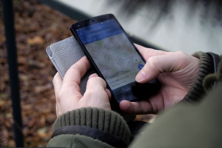
Google is adding a new layer to its Google Maps navigation app this week, to provide users with more information about the number of confirmed coronavirus infections in a certain area.
The 'Covid-19 info' layer will show the spread of the virus in certain areas and can be found via a button in the top right corner of the app, product manager at Google Sujoy Banerjee wrote in a blog post on Wednesday.
The layer shows a seven-day average of new Covid-19 cases per 100,000 people for the area of the map the user is looking at, as well as a label that indicates whether the trend of the cases is going up or down.
Related News
- Belgium breaks 1,400 new coronavirus infections per day, hospitalisations rise sharply
- Coronavirus: Belgium listed among European countries with 'worrying trends'
- Covid-19 circulates more strongly in Brussels, Sciensano says
To quickly see the density of new infections in an area, the layer will be colour coded as well, going from grey (fewer than one infection per 100,000 inhabitants in the past seven days) to dark red (over 40 per 100,000 inhabitants).
The data will be visible at the country level for all 220 countries and territories that Google Maps supports, but also at state or province, county, and city-level if the data is available.
Google will get the necessary data via multiple sources, such as the Johns Hopkins Institute, The New York Times and Wikipedia, which get their data from public health organisations such as the World Health Organisation (WHO), government health ministries and more local health agencies and hospitals.
The worldwide rollout of this extra information layer will start this week, on Android and iOS, according to Banerjee.
Maïthé Chini
The Brussels Times

